Responsive web design is getting a lot of press lately. Google’s recent algorithm change in April, 2015 pushed the word responsive into every website owner’s vocabulary. But what is responsive web design and why do you need it for your site?
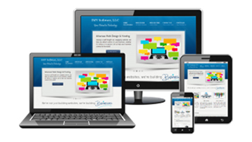
A responsive web page is one that automatically shifts the content of the page around to display properly on any size screen. This allows someone on a phone to have the same experience as someone on a desktop computer or a tablet. All the same images and text will be displayed on the site, just rearranged depending on the size of the browser window. One easy way to tell if a webpage is responsive is to change the size of your browser window around. A responsive page will automatically resize and rearrange itself to appear correctly no matter what size window you’re using.
Here’s why you should consider a responsive website. Many sites that previously used a completely separate web design for mobile users have switched to responsive designs that give mobile and desktop users the same experience. This allows the site to look great on a 6-inch iPhone, a 5-inch android, a 4-inch windows phone, an 8-inch tablet, a 15-inch monitor and even a 40-inch TV. It’s not just your user’s experience: nearly half of all web traffic is mobile and search engines have begun ranking responsive sites that are easy to use on phones as well as computers higher than traditional web pages.
For more info, give us a call at 832-889-9242 or email information@jax-works.com! In the meantime, if you think this will help someone with their business, share this article below.